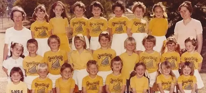
I came across some of my old class photos one day. As i went to a relativly small school, there were only ~25 kids in each grade and the students stayed relativly consistant as the years went on.

I was curious who stood next to who the most over the years in the class photos, and if there was any patterns that showed up.
So, using this as an excuse to play with graphviz and the dot graph language. in this case graph is used in the relationship sense, not the bar and pi graph sense, which is correctly called a chart.
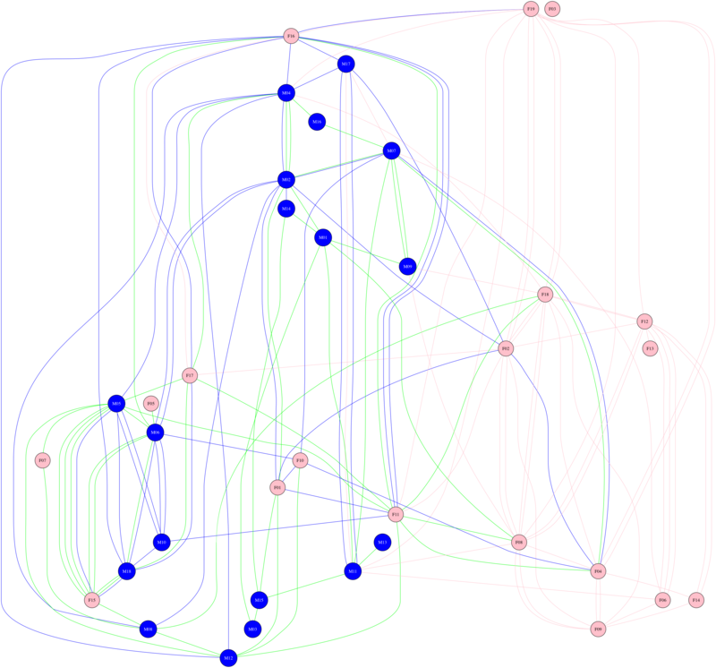
The results are show in the following graph.
- Each student is given a unique code that’s consistant from year to year (eg m05)
- Blue nodes (the circles) are males
- Pink nodes are females
- Blue edges (the lines) are relationships that stood in the back row
- Green stood in the middle row
- Pink sat in the front row of the photo
A few things stand out:
- The front row normally cosists mostly of females
- There is a lot more mix between the back and middle rows than the front row
- The strongst pairing that I can see is between m05 and f15

class photo proximity full size
- Blue Node = Male
- Pink Node = Female
- Blue Edge = backrow
- Green Edge = midrow
- Pink Edge = frontrow